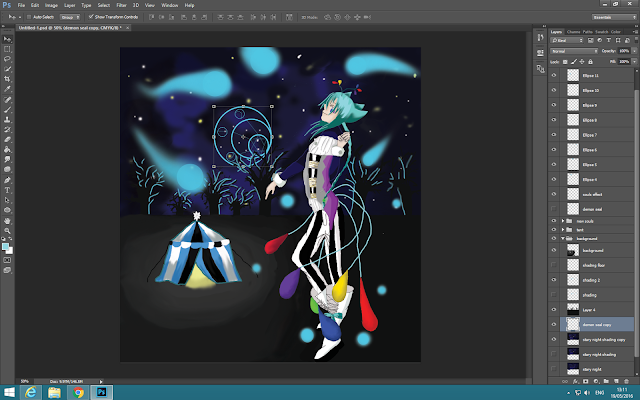
I have took on board Dan's feedback so I have altered my final piece
 |
| i have altered my piece to see how effective bigger lace line would look on my final piece and i think they improve my work a lot more and i think it looks good so i decided to keep the layer |
Sam Yeatman's peer feedback: The scaling for the tent when placed next to the main subject of this work is terrible, so you need to fix this, I would recommend that you move the tent towards the back and scale it down, as this will make sure that the tent is part of the background and this would fix the depth perception. Secondly the 'Souls' that are on this piece of work are just wrong with the way they seemed to be floating. To fix this conundrum I advise reducing the opacity to hide the edges of the 'souls' so it will flow better. After this your premise was about your character being a 'king of the circus' so just add more regal colours to your character. Finally the 'daemon' seal looks like it should be behind the trees to portray a moon, so it could be a sign of his dominance over the area since the moon covers everything in the world with the exceptions of caves and what not.
I have taken on board Sam's feedback so I have altered my final piece.
 |
| i have also put my demon seal in the background to see how it works. I did not like this so i did not use it in my final piece |
Linda Ozola's peer feedback: Callum's work is very creative, as I like how he used different colours on his character to bring it to life and also his drawing skills are amazing! He used different colours to add shadows which is what makes his work look professional, as it looks like it is from an animation company. What I think he needs to improve is to add some bright colours to it to make it stand out more, but other than that his work is great.
I have taken on board Linda's feedback so I have altered my final piece.


As discussed in class, the tent looks a little small, try and make the perspective work. you seem to have very quickly come to this final piece without a huge amount of preparatory sketches or mock ups.
ReplyDelete